· 8 min read
App vs Website: Why Apps Feel Smoother Than Sites
53% of users leave if a site takes over 3 seconds to load. Apps live on your phone; sites reload from the network. See how Twitter and Starbucks fixed it.
You flick the Instagram feed and it glides under your thumb, smooth as ice. The photos are already there before you asked for them. Then you tap the link to that same brand's website in their bio. A white flash, a spinning circle, then the page lurches as it snaps into place.
Same phone. Same Wi-Fi. Same second. One feels alive; the other looks like it's catching its breath. You've felt this a hundred times. Why?
The short answer isn't design. Why do mobile apps run faster and smoother than websites? Because the app lives on your phone. Its screens and logic are already installed. A website, most of the time, reloads over the network every single time. The whole difference is where the work happens. Below we'll break it down with numbers and real cases: Twitter, Starbucks, Pinterest.
The difference your eye catches: 16 milliseconds
Smoothness isn't a matter of taste. You can measure it.
Your phone's screen redraws 60 times a second. That leaves each frame just 16 milliseconds. A single blink takes you
about 100 milliseconds, and in that one blink the phone has to redraw the whole screen six times over. Miss the budget,
frames drop, and your eye catches it instantly. Engineers call that stutter jank.
Researchers have spent decades measuring how long people will wait. Jakob Nielsen's classic thresholds look like this:
| Response time | What a person feels |
|---|---|
| 0.1 second | Instant: the system answered right away |
| 1 second | Your train of thought holds |
| 10 seconds | Attention is gone, and so is the person |
There's one more line. In 1982, IBM engineers found that once a system answers in under ~400 milliseconds, people stop
waiting and slip into flow. Google's rule of thumb is close: respond to a tap within 100 milliseconds, animate at 60
frames a second.
The secret: the app lives on your phone; the site arrives from the network every time
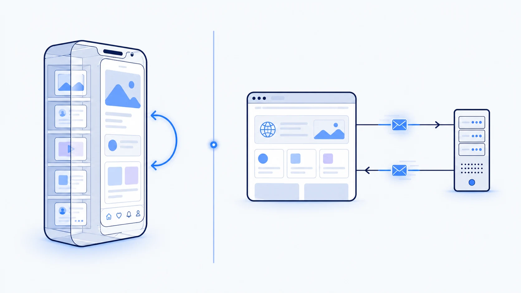
Every time you open a page, a website sends a runner across town: "bring me a fresh copy." An app keeps the whole book on your shelf. It just flips to the next page.
A native app's screens, buttons, and layout logic are already installed on your phone. When you tap, the app mostly rearranges what's already there. There's no internet to wait for.
An ordinary website usually re-requests the page over the network on every move. That's a round trip to a distant server and back, then a fresh download and a fresh render. On mobile data or a weak signal, that round trip is the lag you feel.
Apps also keep your data on the phone and sync in the background. That's why yesterday's messages are on screen before the network even answers.
You've felt it: an app opens straight to content, while a site opens to a spinner first.
Illusion is engineering too: how apps hide the wait
A lot of smoothness is a carefully built illusion.
A skeleton screen shows grey blocks and lines instead of content first, as if the page is already here and only needs filling in. A spinner just says "wait." In controlled tests, skeleton screens felt faster at identical real speed. About 20% faster in Viget's test, for one. But it's not magic: a bad, frozen skeleton actually feels slower. Only one that shimmers in the direction of loading reliably works.
Optimistic UI: tap the heart and it fills instantly. The app assumes success, quietly checks with the server, and only rolls back on an error. Likes on Instagram and Twitter work exactly this way.
Predictive loading: while you read the current screen, the app quietly prepares the one you're most likely to open next.
Websites can do every one of these tricks; most just don't.
Why so many sites feel slow: what breaks site speed
The round trip from the last section is only the floor. Many sites pile several more weights on top:
- Heavy
JavaScript: the page's single worker is busy building the layout and literally "can't hear" your tap. The screen freezes for a moment. - Layout reflow: a late-loading ad shoves the text down, right as your thumb commits.
- Third-party baggage: ad scripts, trackers, chat widgets, five separate font files. Each one adds weight and delay.
- The first, uncached load: on a first visit nothing is saved, so everything downloads from zero.
Now the real numbers. They're old, but they point the right way:
- Google's research (2017): if a page doesn't open in 3 seconds, 53% of mobile visits are abandoned. Sites that load in 5 seconds versus 19 saw 70% longer sessions and 35% fewer bounces.
- The same Google/DoubleClick data (2016): the average mobile site took about 19 seconds to load over 3G.
- Akamai (2009): nearly half of people (47%) expect a page in 2 seconds. That's an Akamai figure, not Google. Networks have moved to 4G and 5G since, but the patience threshold hasn't budged.
So if the fix is known, why doesn't every site apply it? Because slowness usually isn't a technical limit but a matter of priorities. Someone chose marketing tags, ad networks, and widgets over speed.
When websites became apps: 4 real cases
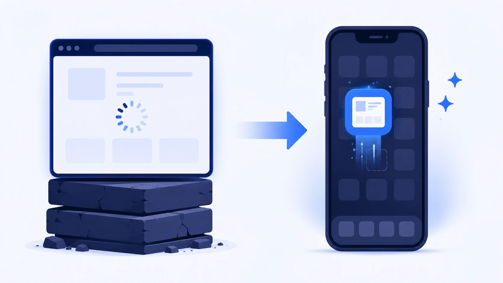
So what happens when a site actually pays the smoothness budget? Around 2017, four major products did exactly that. They rebuilt their websites to behave like apps. Same web, same browser, different decisions.
Such sites are called PWAs (Progressive Web Apps): a site that opens in the browser but works like an app and
keeps its "shell" on the phone.
- Twitter Lite: pages per session rose 65%. The web version was just 600 KB, roughly 40× smaller than the 23.5 MB Android app. (web.dev case study)
- Starbucks: daily active web users doubled. The web app is 233 KB, about 600× smaller than the 148 MB iOS app. 148 MB is a season of a podcast; 233 KB is a couple of text messages. Same order screen.
- Pinterest: ad revenue rose 44% and core engagement 60%. Load over 3G dropped from 23 seconds to under 5. The old site had converted only 1% of mobile users.
- Tinder Online: load fell from 11.91 to 4.69 seconds, and first paint from about 1 second to 0.5. The web version is 2.8 MB instead of the 30 MB+ native app. (Addy Osmani's case study)
Here it is in one table. All of them were rebuilt as PWAs:
| Site | Size: web vs native | Load: before → after | Key result |
|---|---|---|---|
| Twitter Lite | 600 KB vs 23.5 MB (~40× smaller) | — | +65% pages per session |
| Starbucks | 233 KB vs 148 MB (~600× smaller) | — | 2× daily active web users |
| — | 23s → under 5s (3G) | +60% engagement, +44% ad revenue | |
| Tinder | 2.8 MB vs 30 MB+ | 11.91s → 4.69s | near-native experience |
None of this needed the App Store. It needed a team that decided the web version deserved the same care.
So is this gap permanent?
Native apps still win in a few places.
- Deep technical work: heavy 3D games, camera, Bluetooth, sensors, and tight background processing.
- The iPhone reality: on iPhones,
PWAs are still second-class. Apple long restricted install, stored data, and push notifications, so "add to home screen" works noticeably worse on iOS. - Distribution and trust: presence in the App Store, ratings, re-engagement through push, the home-screen icon users expect. A website gets none of that for free.
On feel, the web has nearly closed the gap; on capability, not entirely yet.
Those decisions show up in small things. Next time you use any product, you'll spot them yourself:
- a skeleton screen instead of a spinner;
- a heart that "filled" before the server even answered;
- a page that doesn't jump while it loads.
Those are the signs of smoothness. A smooth product respects your attention, those 16 milliseconds. One that freezes is indifferent to it.
Remember the scene from the start: the gliding Instagram feed and the lurching brand site. That site didn't lose to the App Store. It lost to a team that made different decisions than Instagram's did.
Next time a site feels alive, someone paid attention. And if it stutters, now you know exactly what they skipped.
Related articles

How to Tell If an Image Is AI-Generated: 7 Signs
People spot AI-generated faces just 48% of the time. Three free tools to verify any image in 30 seconds — from fake payment screenshots to deepfake ads.
Claude Fable 5: What It Is and Why the Hype?
What Claude Fable 5 actually does — a smart Telegram bot, reading receipts and contracts, customer support — and when it's overkill for a small business.

How Much Does a Website Cost and What Affects Price?
One 'website' means dozens of different products — and prices, from 750K to 50M so'm. We'll show what yours will cost and how not to overpay.